【已重置】【学习记录】python matplotlib 自学入门(随缘更新).md

说明 - 2022 - 09 - 07

已经完成人工重置,发布时间设定在1444年11月11日,表示这篇博文写于博客建立之前,并于为重置的远古文章区分。

说明 - 2022-05-05

本篇博客为本人原创, 原发布于CSDN, 在搭建个人博客后使用爬虫批量爬取并挂到个人博客, 出于一些技术原因博客未能完全还原到初始版本(而且我懒得修改), 在观看体验上会有一些瑕疵 ,若有需求会发布重制版总结性新博客。发布时间统一定为1111年11月11日。钦此。

建议

画图建议去matplotlib官网搬砖

貌似基础

add_subplot 前两个参数表示把面板划分成怎样的形状(几行几列)第三个参数表示图在面板中的位置

1
2
3
4
import matplotlib.pyplot as plt
fig =plt.figure()
ax1 = fig.add_subplot(2,2,1)
ax2 = fig.add_subplot(2,2,2)

在这里插入图片描述

1
2
3
fig,axes = plt.subplots(nrows= 3,ncols= 3)
axes[1,1].set(title = 'middle')
axes[0,2].set(title = 'NE')

在这里插入图片描述

线+貌似基础

画一条线

1
2
3
4
5
fig,ax = plt.subplots()
x = np.linspace(0,np.pi)
y_sinx = np.sin(x)
ax.plot(x,y_cosx,linewidth = 1, markersize = 6,color = 'red',linestyle='-.')
#图上的和这个不一样的写法,一个效果

在这里插入图片描述

加点盐

1
2
3
4
5
fig,ax = plt.subplots()
x = np.linspace(0,np.pi)
y_sinx = np.sin(x)
ax.plot(x,y_cosx,linewidth = 1, markersize = 6,color = 'red',linestyle='-.')
ax.set(title = 'ABC',xlabel = 'X QwQ',ylabel = '-Y---',xlim = [0,5],ylim = [-1.2,1.2])

在这里插入图片描述

填充两线之间的空间

再加点盐 : fill_between 填充两线之间的空间

1
2
3
4
5
6
7
8
fig,ax = plt.subplots()
x = np.linspace(0,np.pi)
y_sinx = np.sin(x)
y_cosx = np.cos(x)
y_tanx = np.tan(x)
ax.plot(x,y_cosx,linewidth = 1, markersize = 6,color = 'red',linestyle='-.')
ax.set(title = 'ABC',xlabel = 'X QwQ',ylabel = '-Y---',xlim = [0,5],ylim = [-1.2,1.2])
ax.fill_between(x,y_cosx,y_sinx,color = 'yellow')

在这里插入图片描述

加入网格线

换一种写法 并加入网格线

1
2
3
4
5
6
7
8
9
10
11
fig,ax = plt.subplots()
x = np.linspace(0,np.pi)
data = {'x' : x,
'sin' : np.sin(x),
'cos' : np.cos(x),
'tan' : np.tan(x)}

ax.plot('x','cos',linewidth = 1, markersize = 6,color = 'red',linestyle='-.',data = data)
ax.set(title = 'ABC',xlabel = 'X QwQ',ylabel = '-Y---',xlim = [0,5],ylim = [-1.2,1.2])
ax.fill_between('x','cos','tan',color = 'yellow',data = data)
ax.grid()

在这里插入图片描述

散点图

参数c同color表示颜色 s表示大小

1
2
3
x = np.arange(6)
y = x*3%8
plt.scatter(x,y,marker = '3',color = ['blue','green','blue','green','blue','green',], s = 600)

在这里插入图片描述

1
2
3
x = np.arange(10)
y = x*3%13
plt.scatter(x,y,marker = '*',c = np.random.rand(10),s = (np.random.rand(10)*30)**2)

在这里插入图片描述

条形图

调整画布大小

参数figsize调整画布大小

1
2
3
4
5
6
7
x = np.arange(10)
y = np.random.randint(0,10,10)
fig,axes = plt.subplots(ncols = 2,figsize = (20,6))
axes[0].bar(x,y,color = 'red')
axes[0].set(title = 'E GAY WOLY GIAO~GIAO',xlabel = 'q',ylim = [-2,10])
axes[1].barh(x,y,color = 'lightgreen')
axes[1].set(ylim = [-3,15])

在这里插入图片描述

画直线

加一道线

1
2
3
4
5
6
7
8
9
x = np.arange(10)
y = np.random.randint(0,10,10)
fig,axes = plt.subplots(ncols = 2,figsize = (20,6))
axes[0].bar(x,y,color = 'red')
axes[0].set(title = 'E GAY WOLY GIAO~GIAO',xlabel = 'q',ylim = [-2,10])
axes[1].barh(x,y,color = 'lightgreen')
axes[1].set(ylim = [-3,15])
axes[0].axhline(0,color = 'blue',linewidth = 6)
axes[1].axvline(2,color = 'lightgrey',linewidth = 3)

在这里插入图片描述
有负数的情况
在这里插入图片描述

饼图

1
2
3
4
names = ['AA','BB','CC','DD','EE']
weights = [200,300,500,159,66]
plt.pie(weights,labels = names)
pass

在这里插入图片描述

1
2
3
4
5
6
7
8
9
10
11
12
13
14
15
16
17
18
19
names = ['AA','BB','CC','DD','EE']
weights = [200,300,500,159,66]
colors = ['lightblue','lightgreen','red','green','grey']
plt.pie(weights,labels = names,
explode = [0,0,0.1,0.075,0], #每一块离开饼中心的距离
colors = colors, #颜色
shadow = True, #阴影
autopct = '%.4f%%', #显示百分比(格式化输出)
startangle = -30, #绘制角度 (旋转)
counterclock = False, #指针方向 默认=ture为逆时针 False为顺时针
radius = 1.3, #饼图半径
labeldistance = 1.3, #label的位置 (与半径的比例)
pctdistance = 0.3, #显示百分比的文本的位置(与半径的比例)
textprops = None, #文本格式

)
plt.axis('equal') #显示为正圆
plt.legend(loc = 'lower left') #显示图例
pass

在这里插入图片描述
所有图例位置名称

:18: MatplotlibDeprecationWarning: Unrecognized location ‘lower dleft’.
Falling back on ‘best’; valid locations are
best
upper right
upper left
lower left
lower right
right
center left
center right
lower center
upper center
center
This will raise an exception in 3.3.

plt.savefig( ) 保存

条形图+饼图组合 Bar of pie

1
2
3
4
5
6
7
8
9
10
11
12
13
14
15
16
17
18
19
20
21
22
23
24
25
26
27
28
29
30
31
32
33
34
35
36
37
38
39
40
41
42
43
44
45
46
47
48
49
50
51
52
53
54
55
56
57
58
59
60
from matplotlib.patches import ConnectionPatch

fig,[ax0,ax1] = plt.subplots(ncols = 2,figsize = [12,6])

#画饼
names = ['AA','BB','CC','DD','EE']
weights = [200,300,500,159,66]
colors = ['lightblue','lightgreen','red','green','grey']
ax0.pie(weights,
labels = None,
explode = [0,0.1,0,0,0], #每一块离开饼中心的距离
colors = colors, #颜色
shadow = True, #阴影
autopct = '%.4f%%', #显示百分比(格式化输出)
startangle = 100, #绘制角度 (旋转)
counterclock = False, #指针方向 默认=ture为逆时针 False为顺时针
radius = 1, #饼图半径
labeldistance = 0.85, #label的位置 (与半径的比例)
pctdistance = 0.65, #显示百分比的文本的位置(与半径的比例)
textprops = None, #文本格式

)
ax0.axis('equal') #显示为正圆
ax0.legend(names,loc = 'upper left') #显示图例
ax0.set(title = 'Big')

#画柱
rates = [0.33,0.56,0.07,0.04]
posX = 0
floor = 0
width = 0.2

for i in range(len(rates)):
height = rates[i]
ax1.bar(posX,height,width,bottom = floor)
posY = ax1.patches[i].get_height() / 2 + floor
ax1.text(posX,posY,'%d%%' % (rates[i]*100), ha = 'center')
floor += ax1.patches[i].get_height()

ax1.set(ylim = [0,1],xlim = [-0.5,2],title = 'Small')
ax1.axis('off') #边框消失
ax1.legend(['B1','B2','B3','B4'],loc = 'center')

#划线
top = 1
startangle = 0 #曾经多此一举加上了起始角度
center, r = ax0.patches[2].center, ax0.patches[2].r
theta1,theta2 = ax0.patches[2].theta1+startangle,ax0.patches[2].theta2+startangle

xb,yb = np.cos(np.pi / 180 * theta2) *r + center[0], np.sin(np.pi / 180 * theta2) *r + center[1]
con = ConnectionPatch(xyA = (-width/2,top), coordsA = ax1.transData, xyB = (xb,yb), coordsB = ax0.transData)
ax1.add_artist(con)

xb,yb = np.cos(np.pi / 180 * theta1) *r + center[0], np.sin(np.pi / 180 * theta1) *r + center[1]
con = ConnectionPatch(xyA = (-width/2,0), coordsA = ax1.transData, xyB = (xb,yb), coordsB = ax0.transData)
ax1.add_artist(con)
con.set_color([1,0.5,0])
con.set_linewidth(5)

pass

在这里插入图片描述

嵌套环形图+条形图组合 实例

太急于实现写的乱起八糟,以后可以复习思路
2021年2月9号东八区凌晨画完的,于同日中午放上来

1
2
3
4
5
6
7
8
9
10
11
12
13
14
15
16
17
18
19
20
21
22
23
24
25
26
27
28
29
30
31
32
33
34
35
36
37
38
39
40
41
42
43
44
45
46
47
48
49
50
51
52
53
54
55
56
57
58
59
60
61
62
63
64
65
66
67
68
69
70
71
72
73
74
75
76
77
78
79
80
81
82
83
84
85
86
87
88
89
90
91
92
93
94
95
96
97
98
99
100
101
102
103
104
105
106
107
108
109
110
111
112
113
114
115
116
117
118
119
120
121
122
from matplotlib.patches import ConnectionPatch
angle = 120
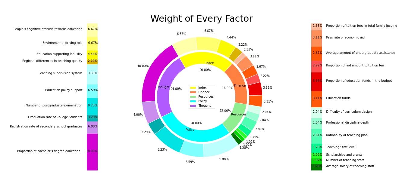
fig,[ax0,ax1,ax2] = plt.subplots(ncols = 3,figsize = [27,9])
names = ['Index','Finance','Resources','Policy','Thought']
weights = [0.2,0.16,0.12,0.28,0.24]
cc = ['yellow','#ff8040','lightgreen','#00ffff','#b15bff']
cc.extend(['red']*4)

ax1.pie(weights,labels = names,
explode = [0,0,0,0,0], #每一块离开饼中心的距离
colors = cc, #颜色
shadow = False, #阴影
autopct = '%.2f%%', #显示百分比(格式化输出)
startangle = angle, #绘制角度 (旋转)
counterclock = False, #指针方向 默认=ture为逆时针 False为顺时针
radius = 0.75, #饼图半径
labeldistance = 0.75, #label的位置 (与半径的比例)
pctdistance = 0.6, #显示百分比的文本的位置(与半径的比例)
textprops = None, #文本格式
wedgeprops = dict(width = 0.2,edgecolor = 'white')
)
ax1.legend(loc = 'center')
#color = ['red'] *23
color = ['#ffffaa','#ffff6f','#f9f900','#d9b300']
color.extend(['#ffbd9d','#ff8f59','#ff5809','#ff5151','#ea0000','#ff5809'])
color.extend(['#d7ffee','#96fed1','#4efeb3','#02f78e','#28ff28','#00db00','#007500'])
color.extend(['#bbffff','#80ffff','#00e3e3','#00aeae'])
color.extend(['#ca8eef','#d200d2'])
small_n = ['','','','','','','','','','','','','','','','','','','','','','','']
small = [6.667,6.667,4.444,2.222,1.333,3.111,2.667,2.222,3.556,3.111,2.043,2.043,2.809,1.787,1.021,1.021,1.277,9.882,6.588,8.235,3.294,6,18]
ax1.pie(small,
labels = small_n,
explode = [0]*23, #每一块离开饼中心的距离
colors = color, #颜色
shadow = False, #阴影
autopct = '%.2f%%', #显示百分比(格式化输出)
startangle = angle, #绘制角度 (旋转)
counterclock = False, #指针方向 默认=ture为逆时针 False为顺时针
radius = 1, #饼图半径
labeldistance = 0.85, #label的位置 (与半径的比例)
pctdistance = 1.1, #显示百分比的文本的位置(与半径的比例)
textprops = None, #文本格式
wedgeprops = dict(width = 0.22,edgecolor = 'white')
)
ax1.axis('equal') #显示为正圆

#画柱
lll = [1.333,3.111,2.667,2.222,3.556,3.111,2.043,2.043,2.809,1.787,1.021,1.021,1.277]
colorssss = ['#ffbd9d','#ff8f59','#ff5809','#ff5151','#ea0000','#ff5809','#d7ffee'
,'#96fed1','#4efeb3','#02f78e','#28ff28','#00db00','#007500']
colorssss.reverse()
lll.reverse()
ttt = ['Proportion of tuition fees in total family income'
,'Pass rate of economic aid'
,'Average amount of undergraduate assistance'
,'Proportion of aid amount to tuition fee'
,'Proportion of education funds in the budget'
,'Education funds'
,'Difficulty of curriculum design'
,'Professional discipline depth'
,'Rationality of teaching plan'
,'Teaching Staff level'
,'Scholarships and grants'
,'Number of teaching staff'
,'Average salary of teaching staff']
tttr = ttt.copy()
tttr.reverse()
rates = (np.array(lll)/sum(lll)).tolist()
posX = -0.1
floor = 0
width = 0.2

for i in range(len(rates)):
height = rates[i]
ax2.bar(posX,height,width,bottom = floor,color = colorssss[i])
posY = ax2.patches[i].get_height() / 2 + floor
ax2.text(posX-0.07,posY,'%.2f%% ' % (lll[i])+ tttr[i], ha = 'left')
floor += ax2.patches[i].get_height()

ax2.set(ylim = [0,1],xlim = [-0.5,2],title = '')
ax2.axis('off') #边框消失

#画柱2
#lll = [1.333,3.111,2.667,2.222,3.556,3.111,2.043,2.043,2.809,1.787,1.021,1.021,1.277]
lll = [6.667,6.667,4.444,2.222,9.882,6.588,8.235,3.294,6,18]
#colorssss = ['#ffbd9d','#ff8f59','#ff5809','#ff5151','#ea0000','#ff5809','#d7ffee'
# ,'#96fed1','#4efeb3','#02f78e','#28ff28','#00db00','#007500']
colorssss = ['#ffffaa','#ffff6f','#f9f900','#d9b300','#bbffff','#80ffff','#00e3e3','#00aeae','#ca8eef','#d200d2']
colorssss.reverse()
lll.reverse()
#Z1 : Proportion of bachelor\'s degree education
ttt = ['Proportion of bachelor\'s degree education'
,'Registration rate of secondary school graduates'
,'Graduation rate of College Students'
,'Number of postgraduate examination'
,'Education policy support'
,'Teaching supervision system'
,'Regional differences in teaching quality'
,'Education supporting industry'
,'Environmental driving role'
,'People\'s cognitive attitude towards education']

tttr = ttt.copy()
tttr.reverse()
rates = (np.array(lll)/sum(lll)).tolist()
posX = 1.7
floor = 0
width = 0.2

for i in range(len(rates)):
height = rates[i]
ax0.bar(posX,height,width,bottom = floor,color = colorssss[i])
posY = ax0.patches[i].get_height() / 2 + floor
ax0.text(posX+0.1,posY,ttt[i]+' %.2f%%' % (lll[i]), ha = 'right')
floor += ax0.patches[i].get_height()

ax0.set(ylim = [0,1],xlim = [-0.5,2],title = '')
ax0.axis('off') #边框消失
#ax1.legend(tttr,loc = 'center')

ax1.set_title('Weight of Every Factor',fontsize = 30)
plt.savefig('Weight of Every Factor.png')

在这里插入图片描述

搬砖案例

爬一点空洞骑士1.4.3.2+版本Any完成度速通世界纪录榜,并简单画点图

1
2
3
4
5
6
7
8
9
10
11
12
13
14
15
16
17
18
19
20
21
22
23
24
25
26
27
28
29
30
31
32
33
34
35
36
37
38
39
40
41
42
43
44
45
46
47
48
49
50
51
52
53
54
55
56
57
58
59
60
61
62
63
64
65
66
67
68
69
70
71
72
73
74
75
76
77
78
79
80
81
82
83
84
85
86
87
88
89
90
91
92
93
94
95
96
97
98
99
100
101
102
103
104
105
106
107
108
109
110
111
112
113
114
115
116
117
118
119
120
121
122
123
124
125
126
127
128
129
130
# %matplotlib inline
import matplotlib.pyplot as plt
plt.rcParams['font.family']=['SimHei']
plt.rcParams.update({"font.size":25})
import numpy as np
import pandas as pd
import requests
from bs4 import BeautifulSoup
import os

'''
数据爬取
'''

HK_Any_1432More_SpeedRun_WR_url = 'https://www.speedrun.com/ajax_leaderboard.php?vary=1662443390&timeunits=0&topn=1000&variable9968=144449&variable9966=33306&variable16235=53846&variable45548=156253&variable45549=156255&variable14661=48684&variable25811=86076&variable25810=86073&variable55472=193197&variable45538=156209&variable35461=119744&variable15554=51769&variable9838=32795&variable45550=156257&variable67895=238958&game=hollowknight&layout=new&verified=1&category=44046&platform=&variable11324=&loadtimes=0&video=&obsolete=&date='
headers = None
proxy = None
if not os.path.exists('out'): os.mkdir('out')

res = requests.get(HK_Any_1432More_SpeedRun_WR_url)
soup = BeautifulSoup(res.text, 'lxml')
df = pd.DataFrame(
columns = ['Name', 'TimeWithLoads', 'TimeWithoutLoads', 'date', 'Version', 'Nationality']
)

for i, each in enumerate(soup.find('tbody').findAll('tr')):
cap = each.findAll('td', class_ = 'nobr center hidden-xs')
nationality = each.find('img', class_ = 'flagicon')
lst = [
each.find('span', class_ = 'username').span.string,
cap[0].text,
cap[1].text,
cap[2].text,
each.find('td', class_ = 'nobr center hidden-xs hidden-lg-down').string,
'unknow' if nationality == None else nationality['src'].split('/')[-1][ : -4],
]
df.loc[i] = lst


df = pd.read_csv('HK_Any_1432More_SpeedRun_WR.csv')
df = df[df['Nationality'] != 'unknow']

'''
国籍分布图 pie + bar
'''

nc = df['Nationality'].value_counts()
new_nc = nc[nc >= 9]
new_nc['others'] = len(nc[nc < 9])
idx, val = new_nc.index, new_nc.values


fig, ax = plt.subplots(figsize=(10, 10))
size = 0.3

vals = val
label = idx

cmap = plt.colormaps["tab20c"]
outer_colors = cmap(np.arange(5)*4)
# inner_colors = cmap([1, 2, 5, 6, 9, 10])

ax.pie(vals, radius=1, colors=outer_colors, labels= label,
wedgeprops=dict(width=size, edgecolor='w'))

# ax.pie(vals.flatten(), radius=1-size, colors=inner_colors,
# wedgeprops=dict(width=size, edgecolor='w'))

ax.set(aspect="equal", title='空洞骑士速通排行榜国籍分布')
fig.savefig('out/HKWR榜国籍分布pie.jpg')
plt.clf()
new_nc.plot(kind = 'bar', figsize=(10, 10), title = '空洞骑士速通排行榜国籍分布').figure.savefig('out/HKWR榜国籍分布bar.jpg')
plt.clf()

'''
版本分布图 bar
'''

df['Version'].value_counts().plot(kind = 'bar', figsize=(12, 14), title = '空洞骑士速通排行榜版本分布').figure.savefig('out/HKWR榜版本分布bar.jpg')
plt.clf()

'''
通关时间分布图 bar
'''

class TM:
def __init__(self, data: str):
if 'h' not in data: data = '0h ' + data
self.H, self.M, self.S = data.split()
self.H, self.M, self.S = int(self.H[ : -1]), int(self.M[ : -1]), int(self.S[ : -1])

def __ge__(self, other):
if self.H == other.H:
if self.M == other.M:
return self.S >= other.S
return self.M > other.M
return self.H > other.H

def tostr(self) -> str:
return f'{self.H}h{self.M}m{self.S}s'

def add10M(x: TM):
x.M += 10
if x.M >= 60:
x.M -= 60
x.H += 1
return x

def per10M(x):
I, X = TM('0h 0m 0s'), TM(x)
while True:
I = add10M(I)
if I >= X:
return I.tostr()

df['TimeWithLoads'].map(per10M).value_counts(sort = False).plot(kind = 'bar', figsize=(25, 15), title = '空洞骑士速通排行榜通关时间分布').figure.savefig('out/HKWR榜通关时间分布bar.jpg')
plt.clf()

'''
计算与不计算加载时间的对比
'''

fig,ax = plt.subplots(figsize = (100, 300))

x = range(len(df['TimeWithLoads']))
ax.set_title('空洞骑士速通排行榜计算与不计算加载时间的对比')
ax.plot(x, df['TimeWithLoads'].values)
ax.plot(x, df['TimeWithoutLoads'].values, color = 'red')
plt.savefig('out/HKWR榜计算与不计算加载时间的差距对比bar.jpg')